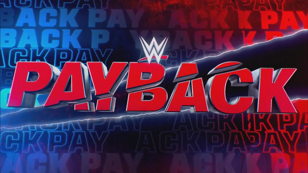
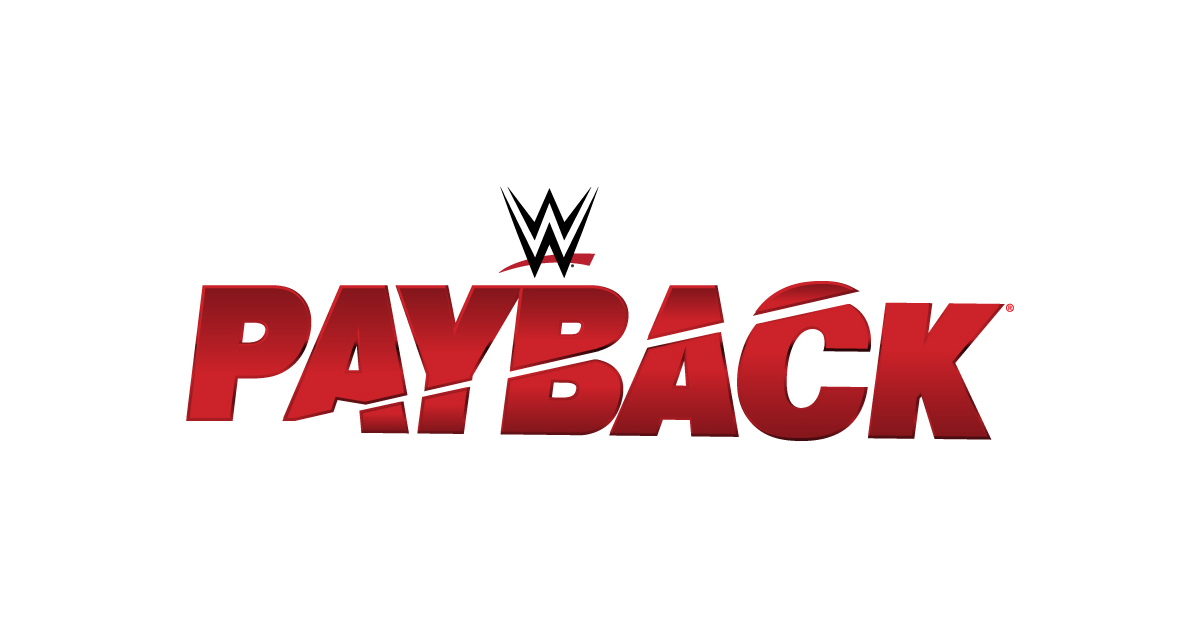
Hey everyone, it’s your boy back again with another little project I messed around with today. As you can tell from the title, I was fiddling around with making a logo for WWE Payback. Wrestling fan here, so this was a fun one for me.

I started off by looking at some of the older Payback logos they’ve used in the past. You know, just to get a feel for the vibe and see what elements they usually incorporate. Some were pretty basic, just text with a bit of flair. Others had that kind of shattered glass effect, or like, a grungy, beat-up look. I also checked out some fan-made ones because you know people on the internet get creative. Found some cool designs on DeviantArt by a user named Simon-Williams-Art, who had some neat WWE-related art, including a few logo concepts.
Then I started sketching out some ideas. I was thinking, what represents “payback”? I messed around with the idea of chains, maybe some broken ones. Tried incorporating a fist, you know, like someone’s about to punch you for revenge. I played around with the font too. Wanted something bold, something that screams “this is gonna be a rough night”. I went back and forth on whether to make it look clean or more distressed. Wrestling is a bit of both, right? You got the clean-cut heroes and the rough-around-the-edges anti-heroes.
After a bunch of rough sketches, I fired up my trusty old design software. I won’t bore you with the technical details, but basically, I started with a simple text-based logo. Just “PAYBACK” in a strong, blocky font. Then I started adding effects. I messed with the colors, gradients, shadows, all that jazz. Tried adding a metallic texture to make it look a bit tougher. I also experimented with adding a cracked effect, like the logo itself had been in a fight.
Here’s a little breakdown of what I tried:
- Font: Started with a basic, bold font, then tried some variations with sharper edges.
- Color: Played around with reds, blacks, and silvers. You know, the classic wrestling colors.
- Effects: Added a gradient, some shadows, and a metallic texture. Also tried a cracked/shattered glass effect.
Honestly, I spent a good chunk of the day just tweaking things. Moving stuff around, changing colors, adding and removing effects. It’s a process, you know? You gotta see what works and what doesn’t. There were definitely some versions that looked absolutely terrible. Like, straight-up garbage. But that’s part of the fun, right? Trying things out, seeing what sticks.

In the end, I came up with a few different versions that I was মোটামুটি happy with. They’re not perfect, but I think they capture the spirit of Payback. I leaned more towards the distressed, grungy look in the final versions. Felt more fitting for an event where people are looking to settle scores. It ended up being a nominally 113 x 40 pixels SVG file.
So yeah, that’s how I spent my day. Messing around with design software, trying to make a cool logo for a wrestling event. It was a fun little project, and it got my creative juices flowing. Maybe I’ll try making logos for other wrestling events in the future. Who knows! Anyway, hope you guys enjoyed this little peek into my creative process. Let me know what you think of the logo!
